Redchurch Corner
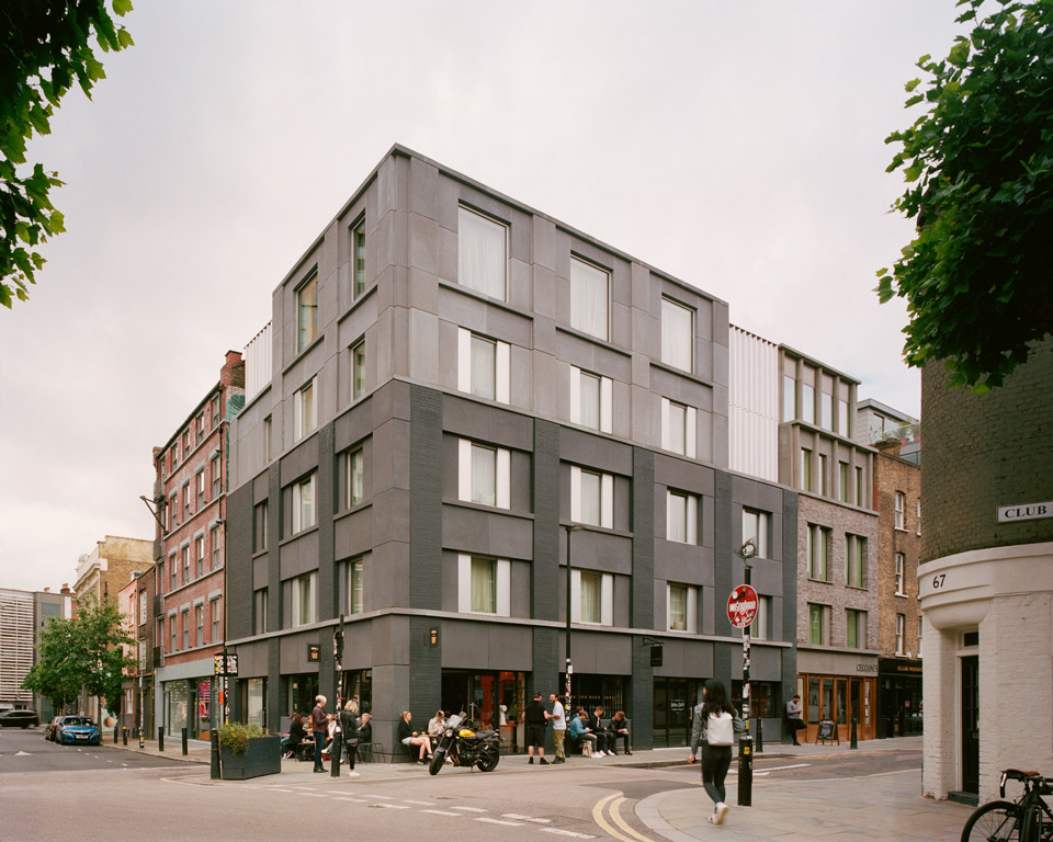
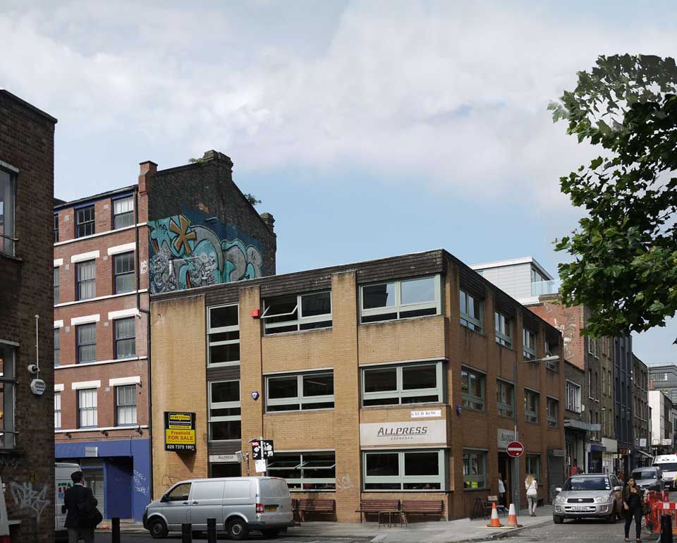
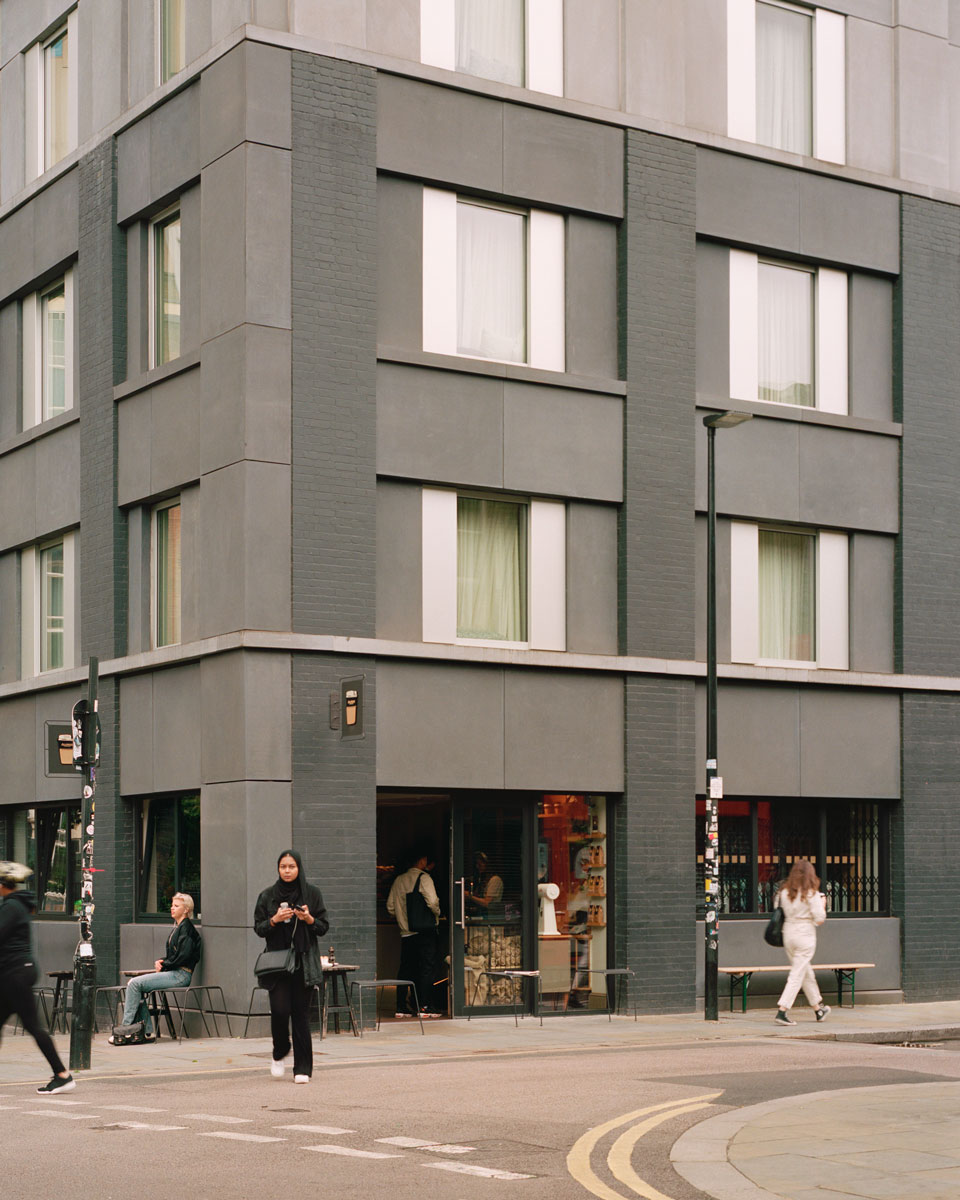
An existing 1960s light-industrial building was adjusted and extended to create a 16-room boutique hotel with a café and retail space at ground floor.
Gentrification is too often synonymous with homogeneity; stripping areas of the innate character and interest that kick-started their regeneration. This project carefully seeks an architecture that is contemporary and civic, but also appropriate, and builds on the character of the area.
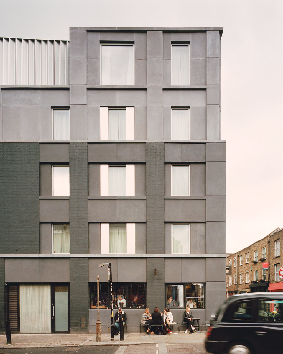
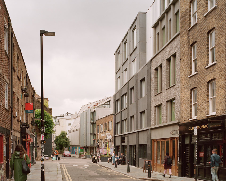
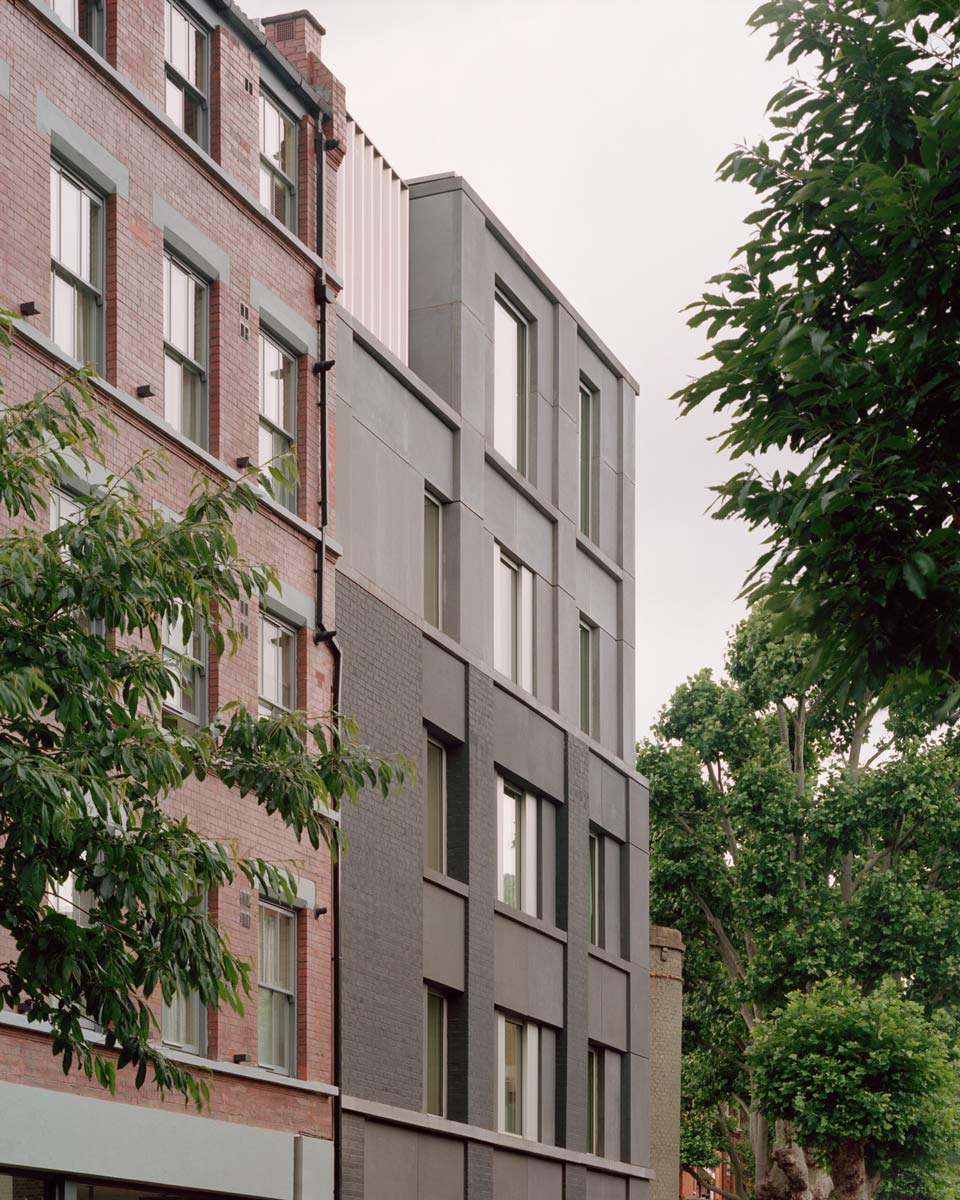
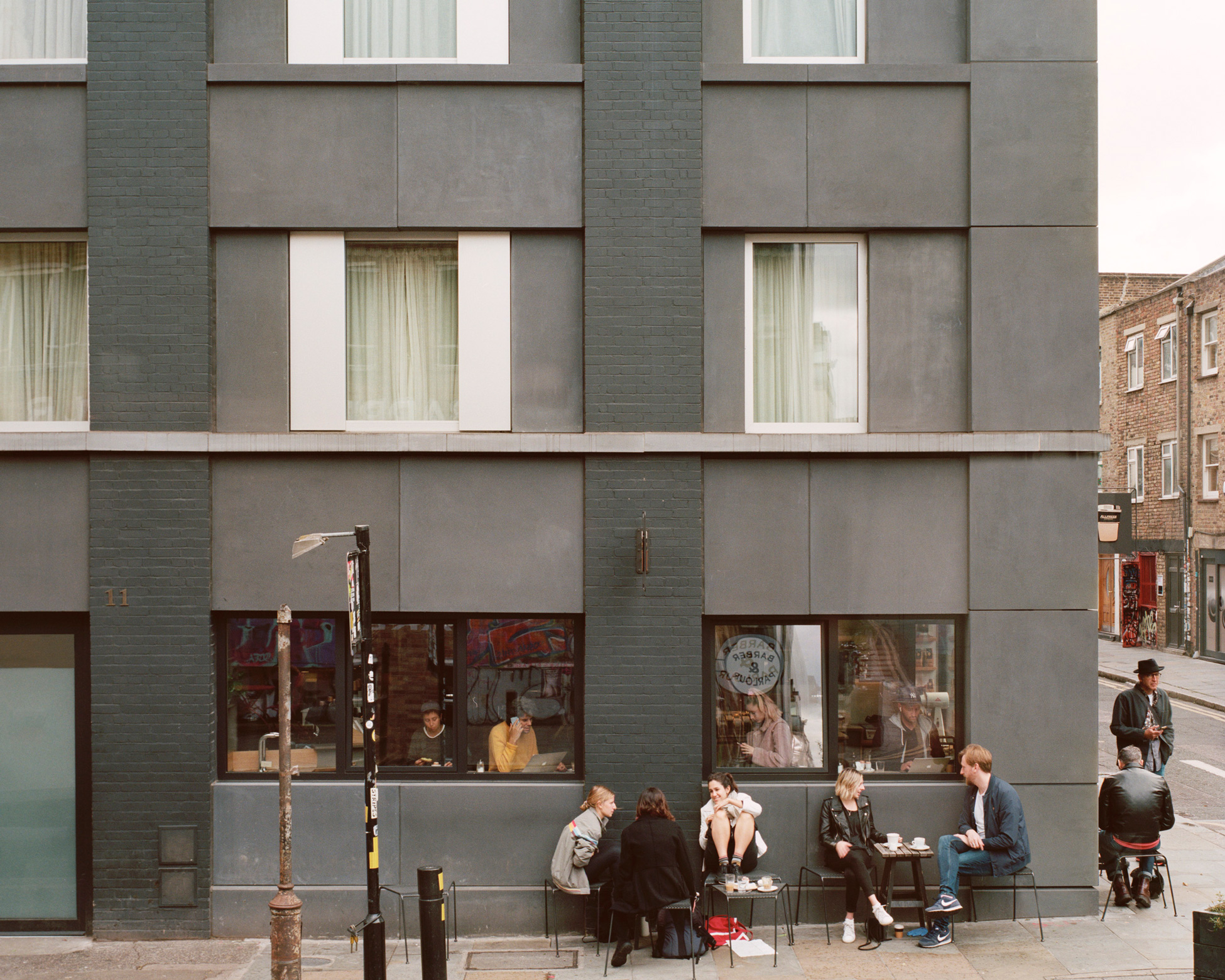
The building was stripped back to its brick-faced concrete frame and new concrete infill panels were added to adjust and scale opening sizes and respond to the more domestic nature of the rooms within; lending a more refined character to the facades and signalling the change in use. The introduction of a continuous concrete band adjusts the proportions of the ground floor, creating a more defined street-level façade. The new facade panels are set in different planes, reflecting the character of the adjacent buildings. The facade on Club Row is deliberately set in greater relief to respond to the adjoining Victorian warehouses, while those on Redchurch Street are flatter, in-keeping with the surrounding Georgian brick facades.
London Legacy Development Corporation included Redchurch Corner in their Design Quality Policy document as an example of high quality and contextually responsible design.
Photography by Rory Gardiner
